
This blog is a written-up version of Serena Samra’s session at SQLBits 2023 called ‘Designing for Accessibility‘. You can watch her session on YouTube here.
The importance.
Accessibility: it’s not a trend, it’s reaching everyone who needs your information. Did you know 1 in 5 people could benefit from accessible reports? That’s a sizeable audience who might miss key points.
Think bigger! Shouldn’t all readers have a smooth experience? WCAG (Web Content Accessibility Guidelines) offers a roadmap to ensure everyone can access the information, from those with visual impairments to people with learning differences. Accessible reports aren’t just for some – they make your work clearer, well-structured, and easier to understand for everyone.
Guess what? Accessibility is already a legal must-have for government websites. But why wait? Let’s be proactive! By prioritising accessible reports, we show our commitment to inclusion and ensure our work reaches the broadest audience possible.
It’s a continuous learning journey. We can all contribute! Don’t be afraid to ask, “How can I make this report more accessible?” Let’s create a collaborative space where asking questions and striving for inclusivity are encouraged.
A Checklist for Report Developers
This checklist provides key actions for report developers to ensure their reports are accessible to a wider audience:
- Avoid unfamiliar acronyms: Spell out acronyms the first time they appear and consider using a glossary for reference.
- Detailed titles: Titles should be clear and concise, accurately reflecting the report’s content.
- Embrace color contrast: Don’t rely solely on color to convey information. Use high-contrast color combinations or provide additional visual cues like shapes or patterns.
- Think beyond color: Utilise shapes and icons in conjunction with, or instead of, color to represent data points.
- Label it right: Include clear and concise data labels for all elements. Consider the option of turning off unnecessary labels to avoid clutter.
- Alt Text: Provide informative alt text descriptions for all visuals, particularly matrices. These descriptions should be clear enough for users who rely on screen readers to understand the data. Explore the use of DAX or API measures to create dynamic alt text that reflects current data values.
- Navigate: Ensure a logical tab order for keyboard users, ideally mirroring the visual layout of the report. Consider using Power BI’s automatic layout analysis for optimal navigation. Remove or hide non-interactive elements that might disrupt keyboard navigation.
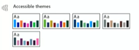
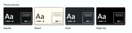
- Leverage accessible themes: Power BI’s WCAG-compliant report themes offer built-in color contrast and accessibility features. Utilize these themes whenever possible.
By following these practices, report developers can create inclusive reports that are user-friendly for everyone, regardless of their abilities.
Accessible tools
Keyboard Shortcuts: Did you know keyboard-only users can create reports entirely with keyboard shortcuts (Alt + Windows)? Even mouse users might find these shortcuts a quicker way to navigate and interact with Power BI. Explore the available shortcuts to boost your efficiency!
Color Themes: Your Windows desktop color theme can automatically sync with Power BI, creating a consistent visual experience across your applications. No need for additional adjustments within Power BI!
For an accessibility checklist, please skip to 10:00 minutes into Serena’s video!